Clay & Glace
pottery, art direction, branding, UI, web, motion design
2021
"But haven't you thought of selling it?
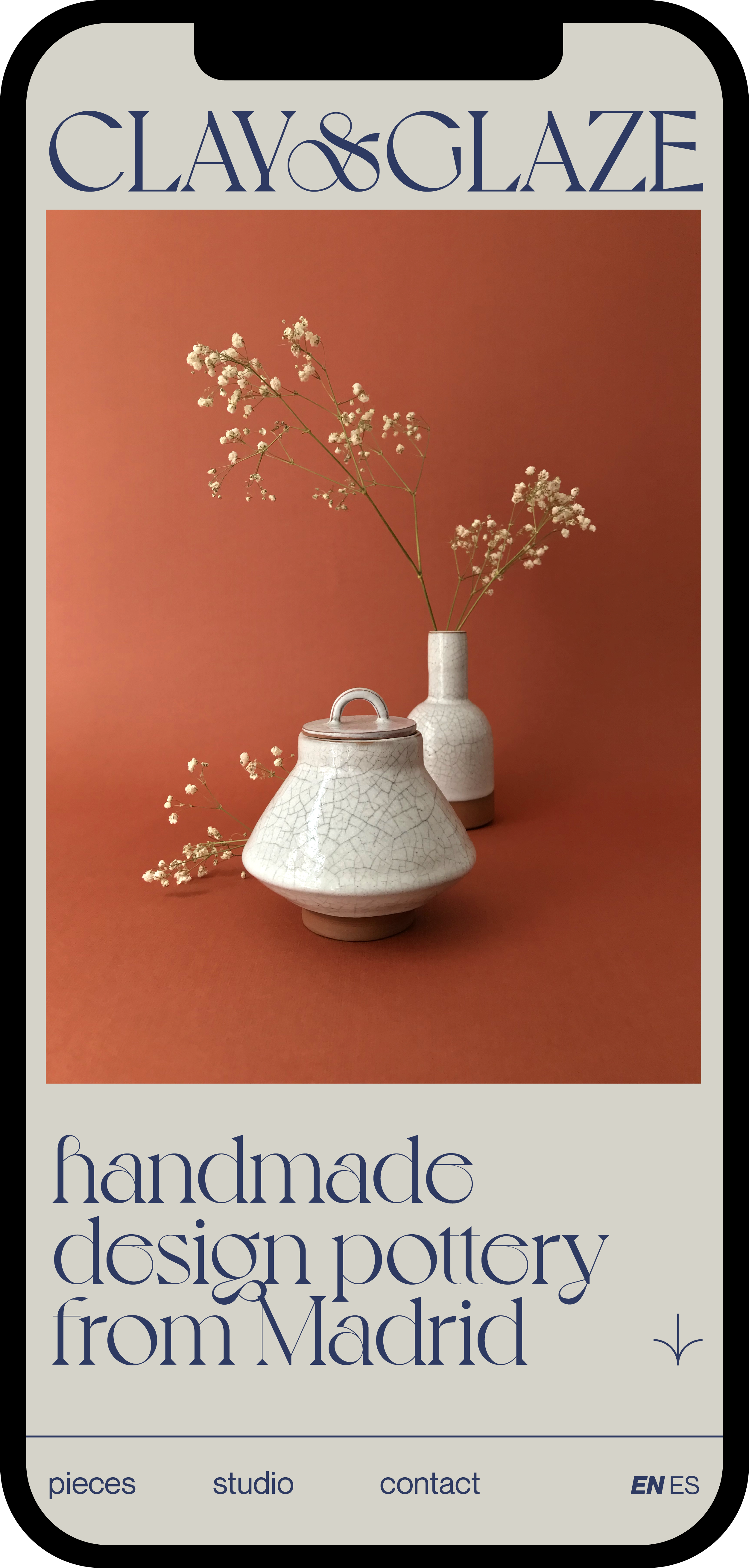
That's the most common phrase I hear when I show people my ceramic works. Yes, besides motion, data & graphic designer I do pottery, I still don't consider myself a "pottery designer" but I'm very happy with the results. For this reason I decided to design a brand, an image and a mock website for my pottery, because there is nothing better than doing something for the love of design.
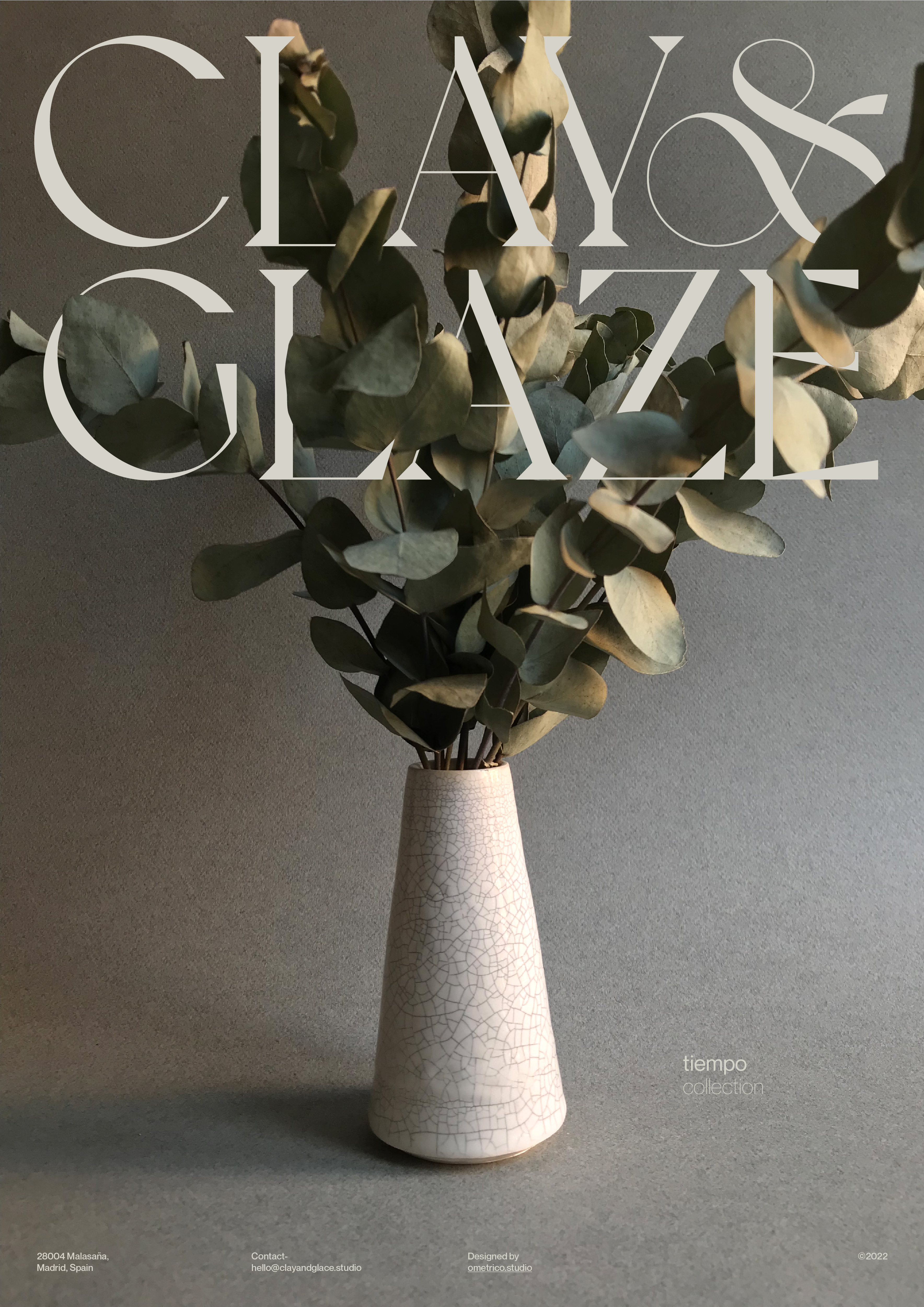
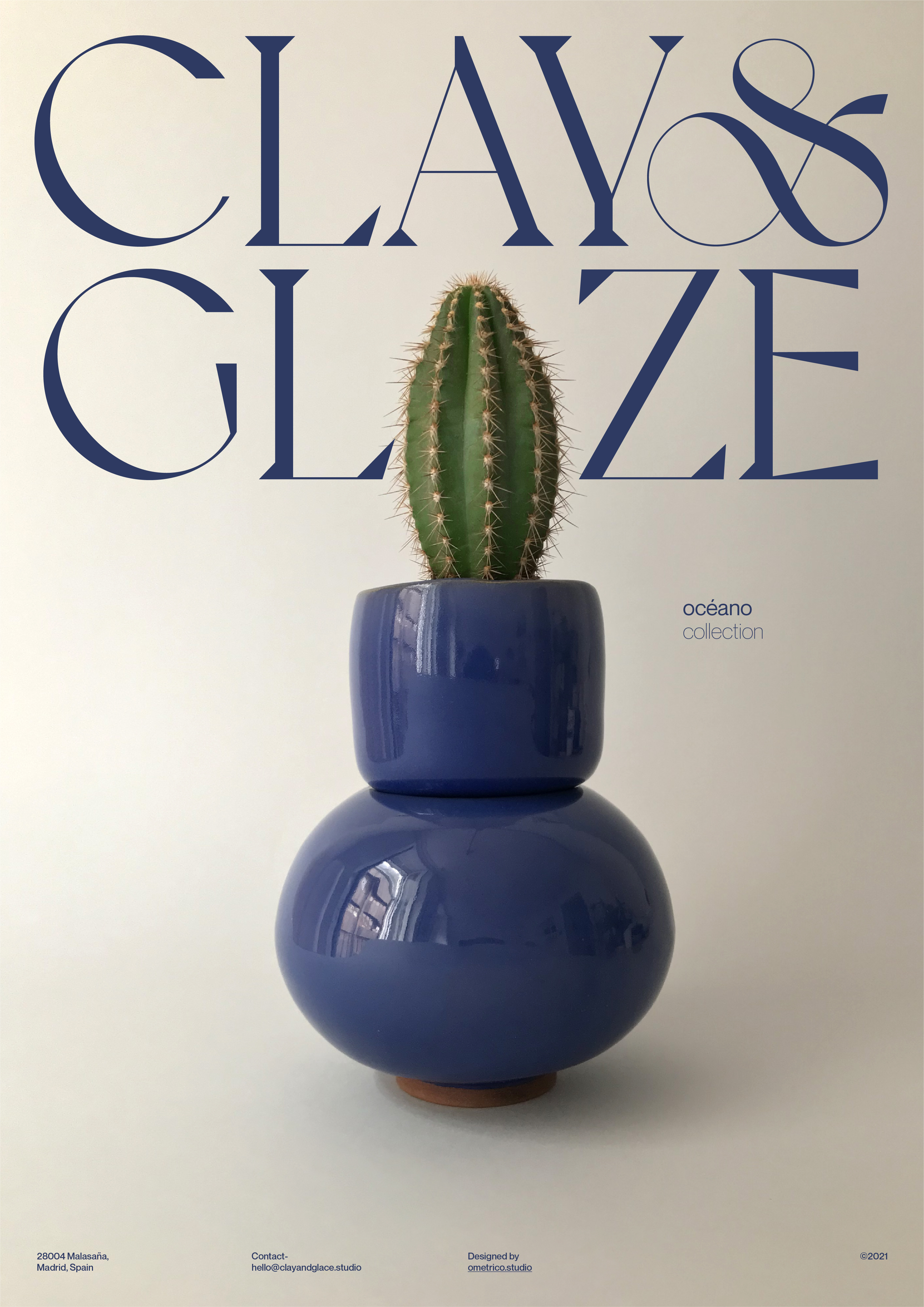
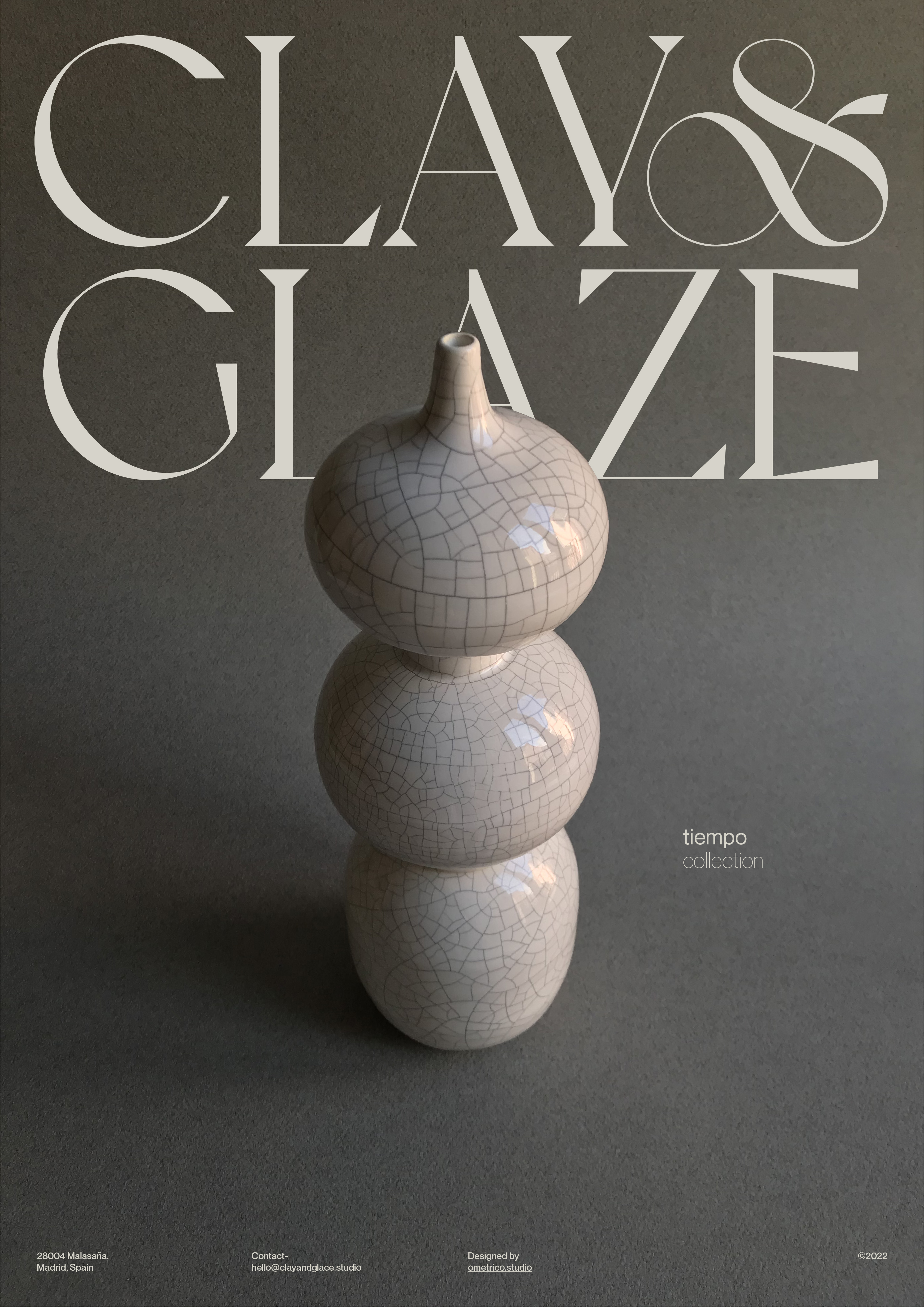
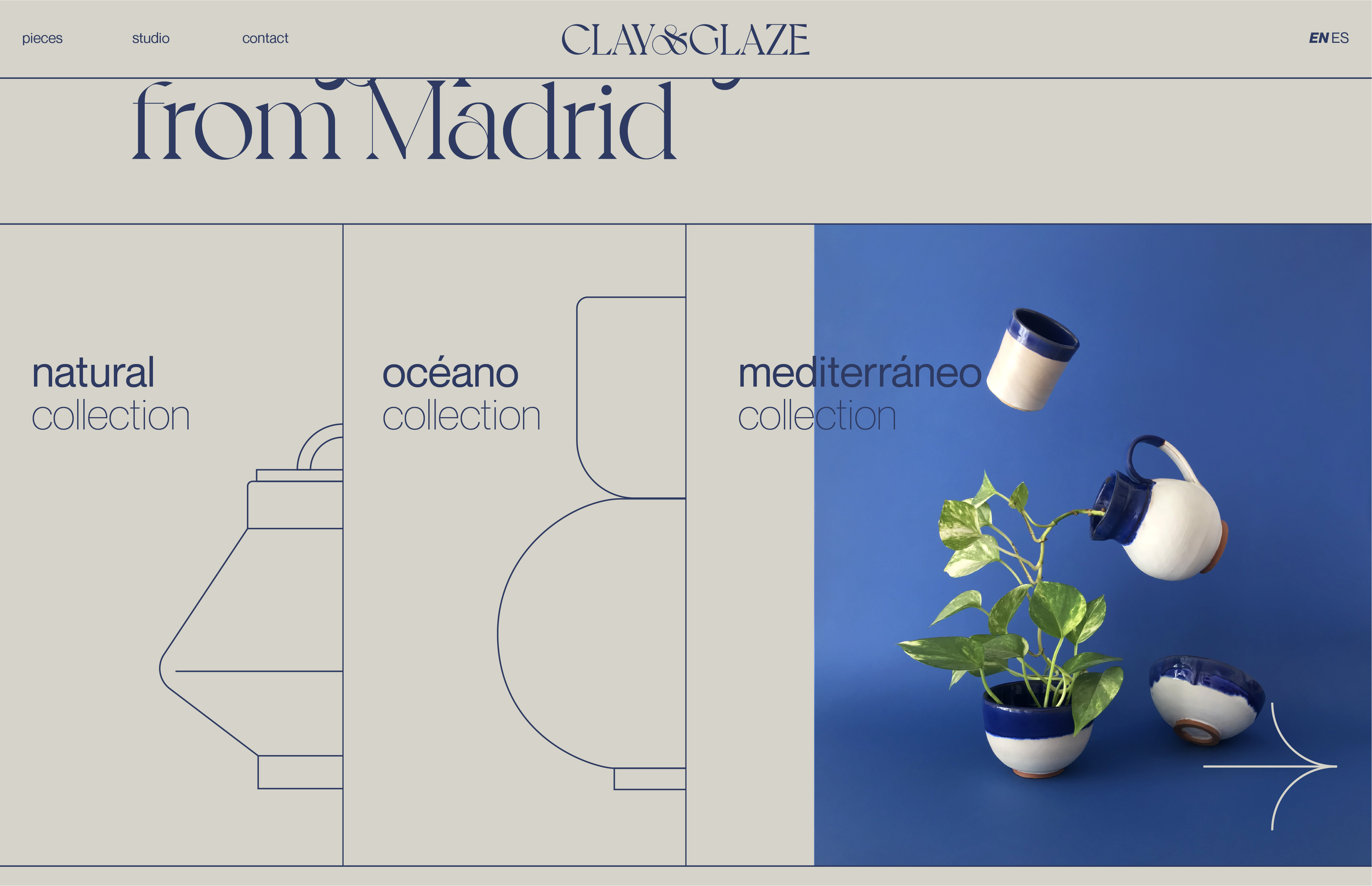
The brand refers to the essential elements that make up the ceramic pieces, the clay and the glaze. From here I wanted to build a visual identity based on the colours of the materials of the pieces, flat contrasted backgrounds and total prominence of the pieces. A graceful and elegant typography, combined with Swiss design elements and compositions. All this accompanied by soft animations with liquid effects such as another of the essential elements in this art, water.
That's the most common phrase I hear when I show people my ceramic works. Yes, besides motion, data & graphic designer I do pottery, I still don't consider myself a "pottery designer" but I'm very happy with the results. For this reason I decided to design a brand, an image and a mock website for my pottery, because there is nothing better than doing something for the love of design.
The brand refers to the essential elements that make up the ceramic pieces, the clay and the glaze. From here I wanted to build a visual identity based on the colours of the materials of the pieces, flat contrasted backgrounds and total prominence of the pieces. A graceful and elegant typography, combined with Swiss design elements and compositions. All this accompanied by soft animations with liquid effects such as another of the essential elements in this art, water.
“¿Pero no has pensando en venderlo?”
Es la frase que más suelo escuchar cuando le enseño a la gente mis trabajos de cerámica. Si, además de motion, data & graphic designer hago cerámica, todavía no me considero un “pottery designer” pero estoy muy contento con los resultados. Por esta razón decidí diseñar una marca, una imagen y una web (ficticia) para mi cerámica, y es que no hay nada mejor que hacer algo por amor al diseño.
La marca hace referencia a los elementos esenciales de los que se componen las piezas de cerámica, el barro “clay” y el esmalte “glaze”. A partir de aquí quise construir una identidad visual basada en los colores de los materiales de las piezas, fondos planos de contraste y total protagonismo de las mismas. Una tipografía grácil y elegante, combinada con elementos y composiciones de diseño suizo. Todo ello acompañado de animaciones suaves con efectos líquidos como otro de los elementos imprescindibles en este arte, el agua.
La marca hace referencia a los elementos esenciales de los que se componen las piezas de cerámica, el barro “clay” y el esmalte “glaze”. A partir de aquí quise construir una identidad visual basada en los colores de los materiales de las piezas, fondos planos de contraste y total protagonismo de las mismas. Una tipografía grácil y elegante, combinada con elementos y composiciones de diseño suizo. Todo ello acompañado de animaciones suaves con efectos líquidos como otro de los elementos imprescindibles en este arte, el agua.


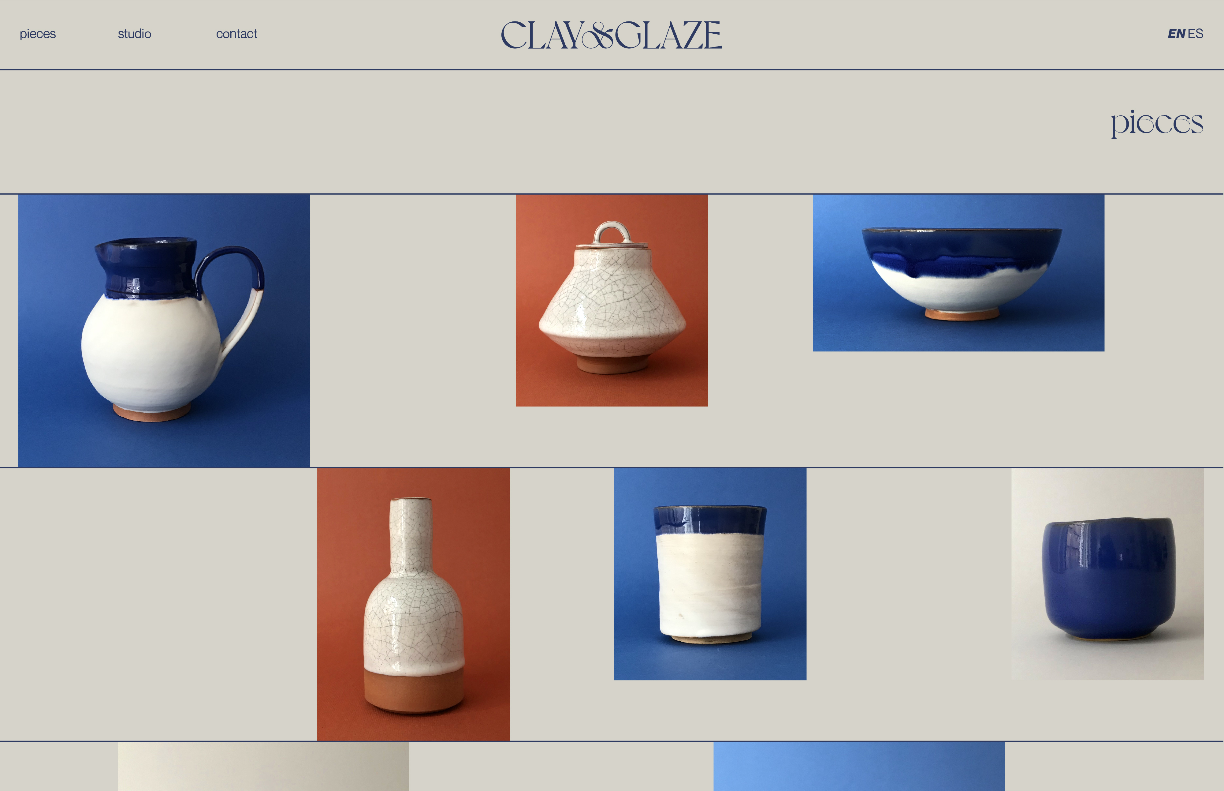
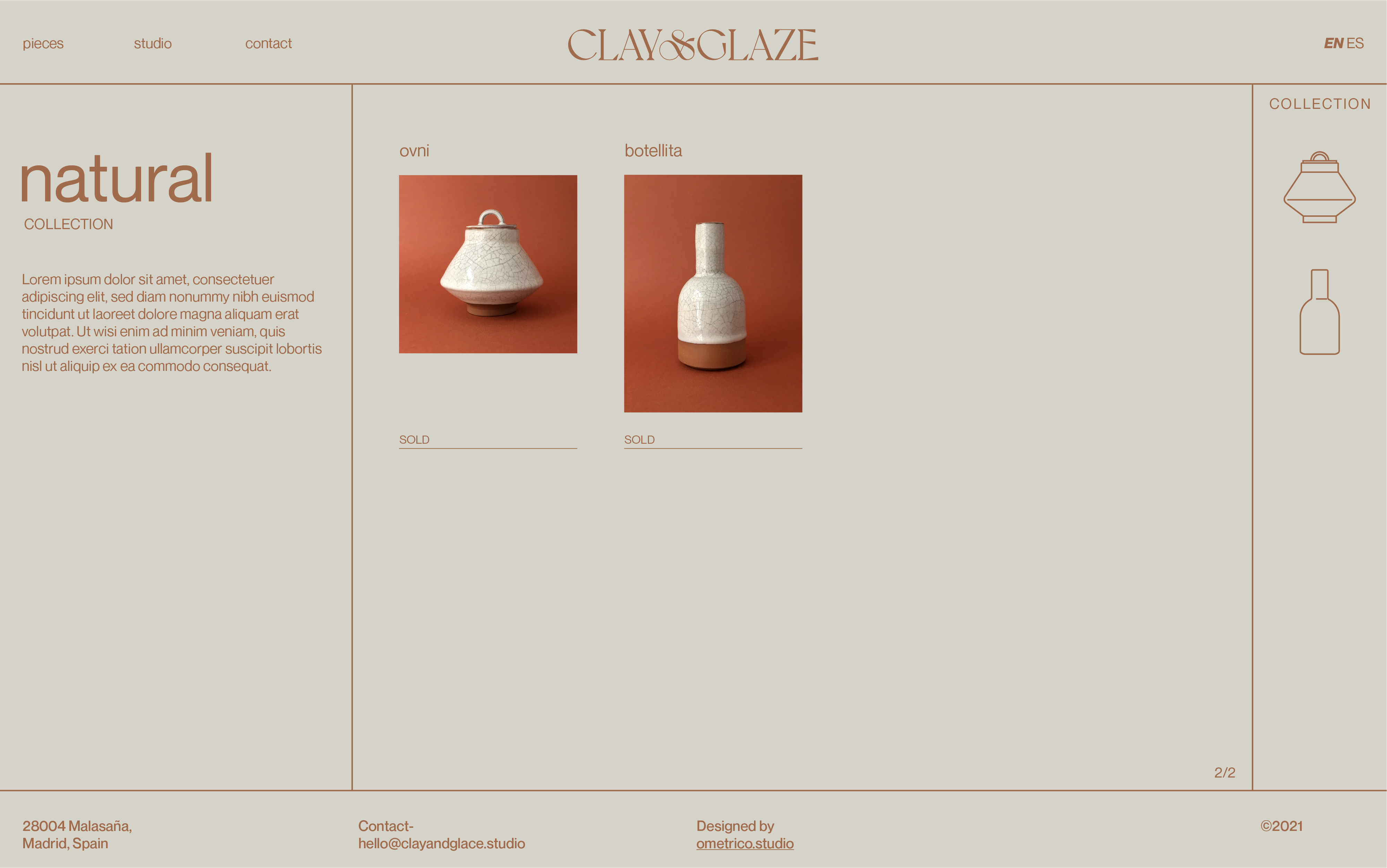
The website is basically structured on three levels: the home page as a container for all the content, collections and product details. A simple structure that is designed to highlight the value of ceramic pieces. Despite its apparent simplicity, conceptually it seeks to make a connection between the materials, the states and the finishes themselves, giving rise to fluid animations and contrasting graphics.
La web se estructura básicamente en tres niveles: la home como contenedor de todo el contenido, colecciones y ficha de producto. Una estructura sencilla que está pensada para poner en valor las piezas de cerámica. A pesar de su aparente sencillez, conceptualmente busca hacer una conexión entre los materiales, los estados y los propios acabados, dando lugar a unas animaciones fluidas y una gráfica de contrastes.
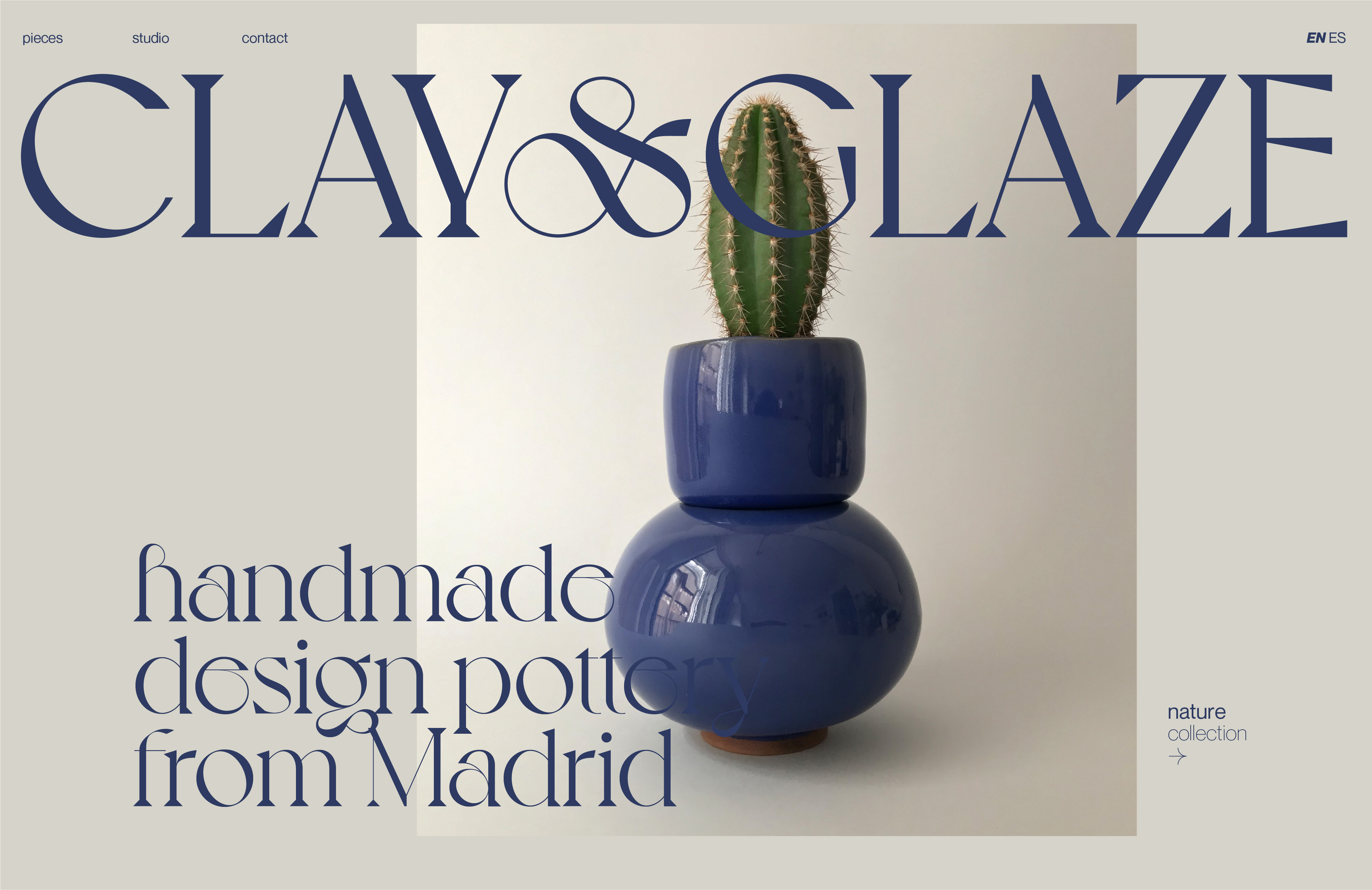
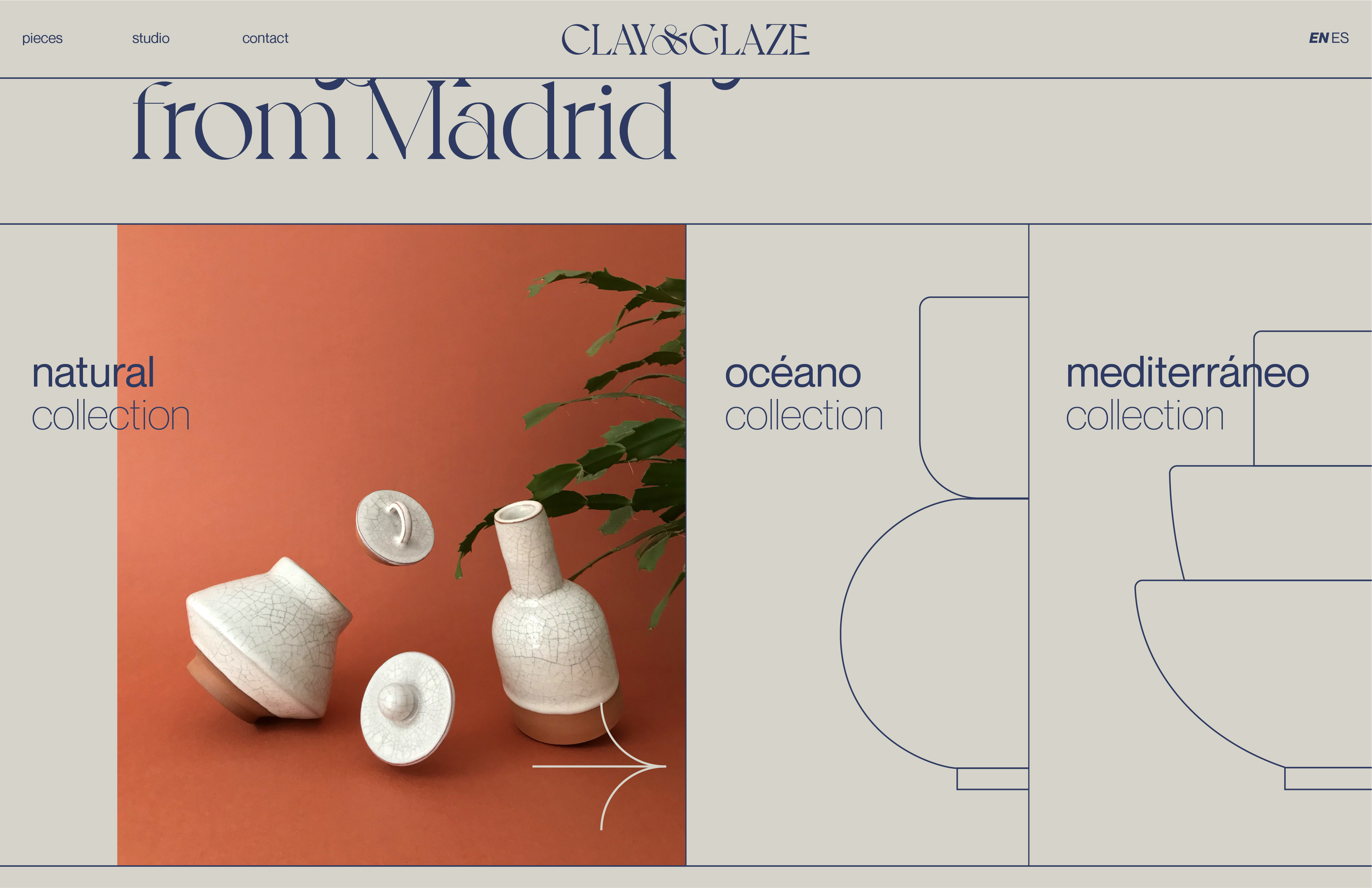
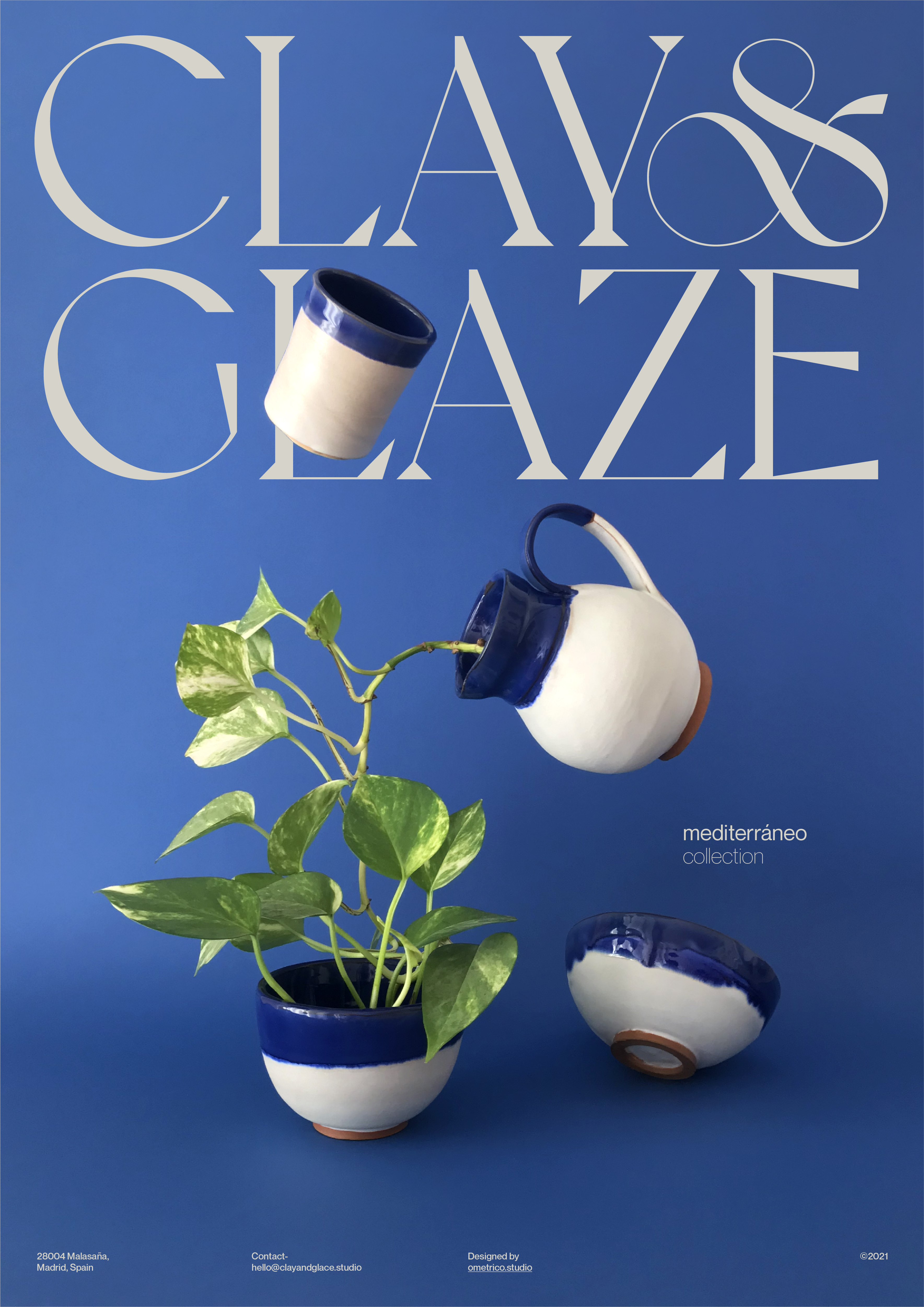
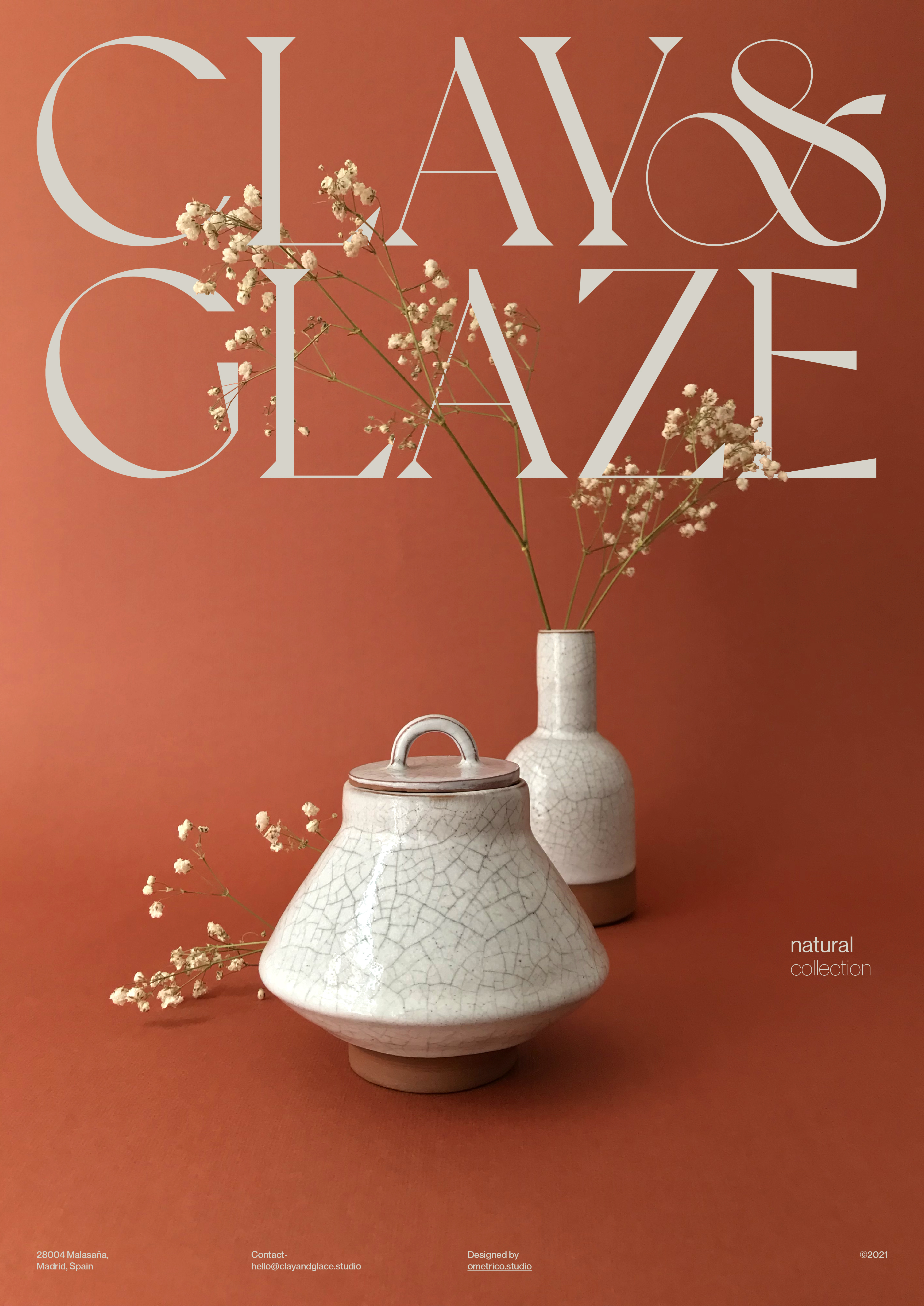
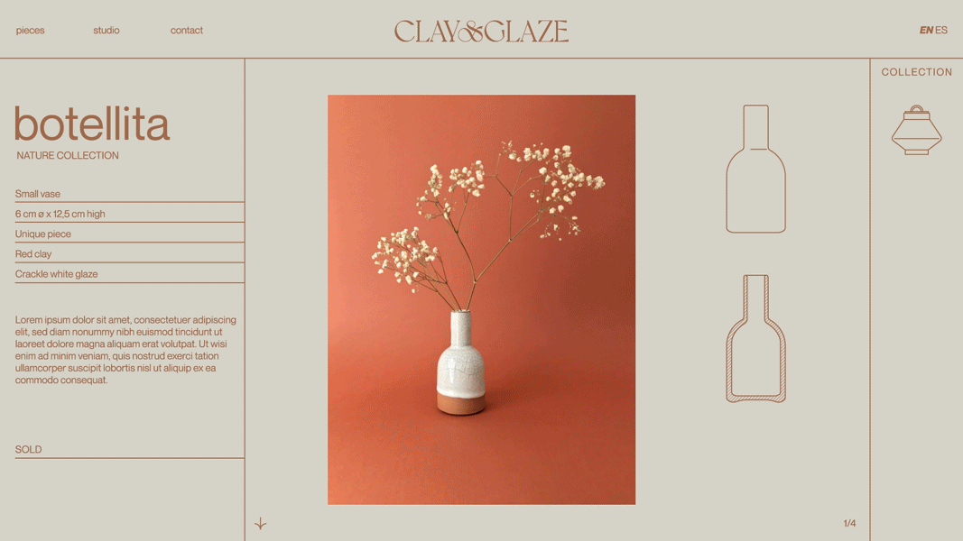
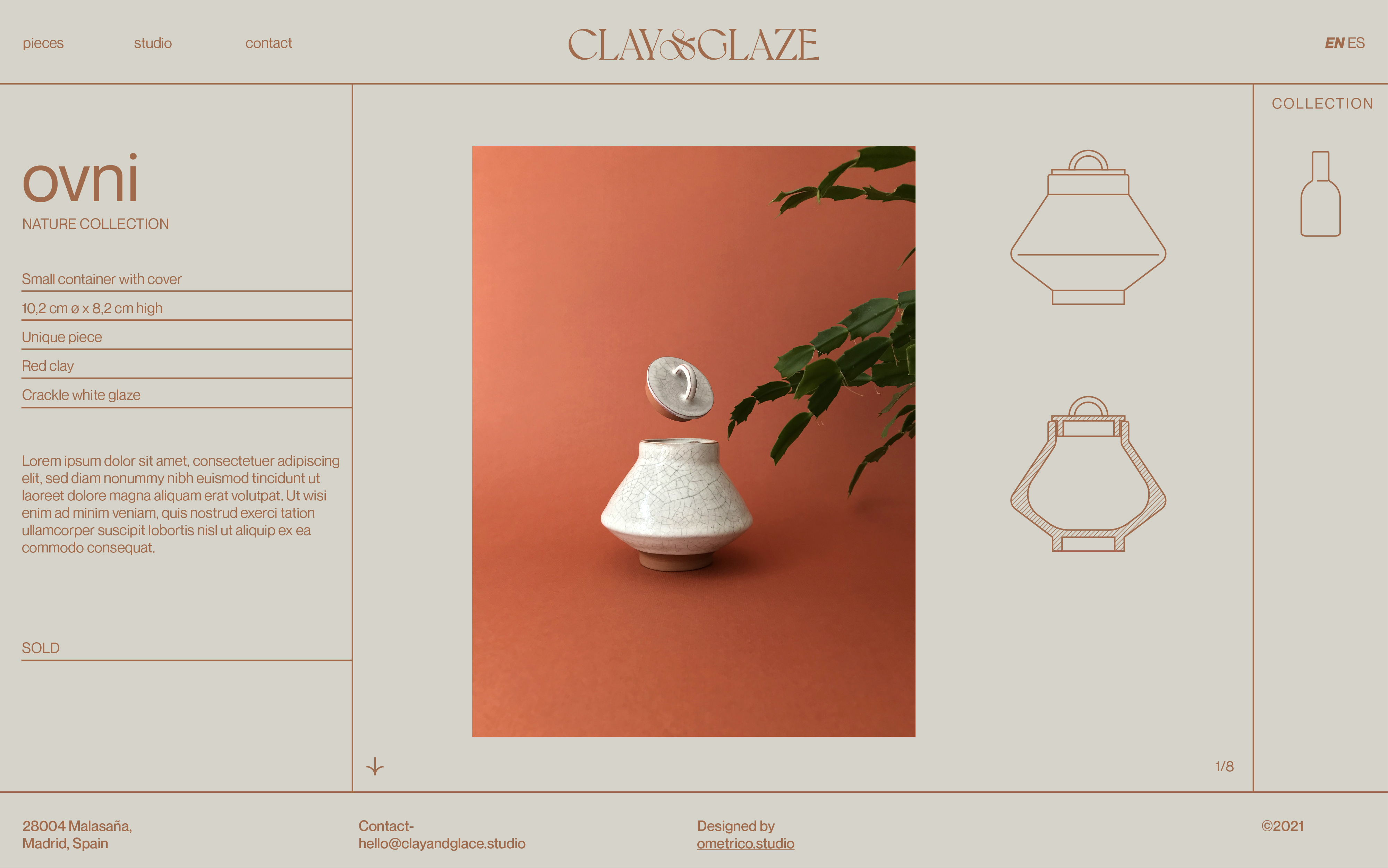
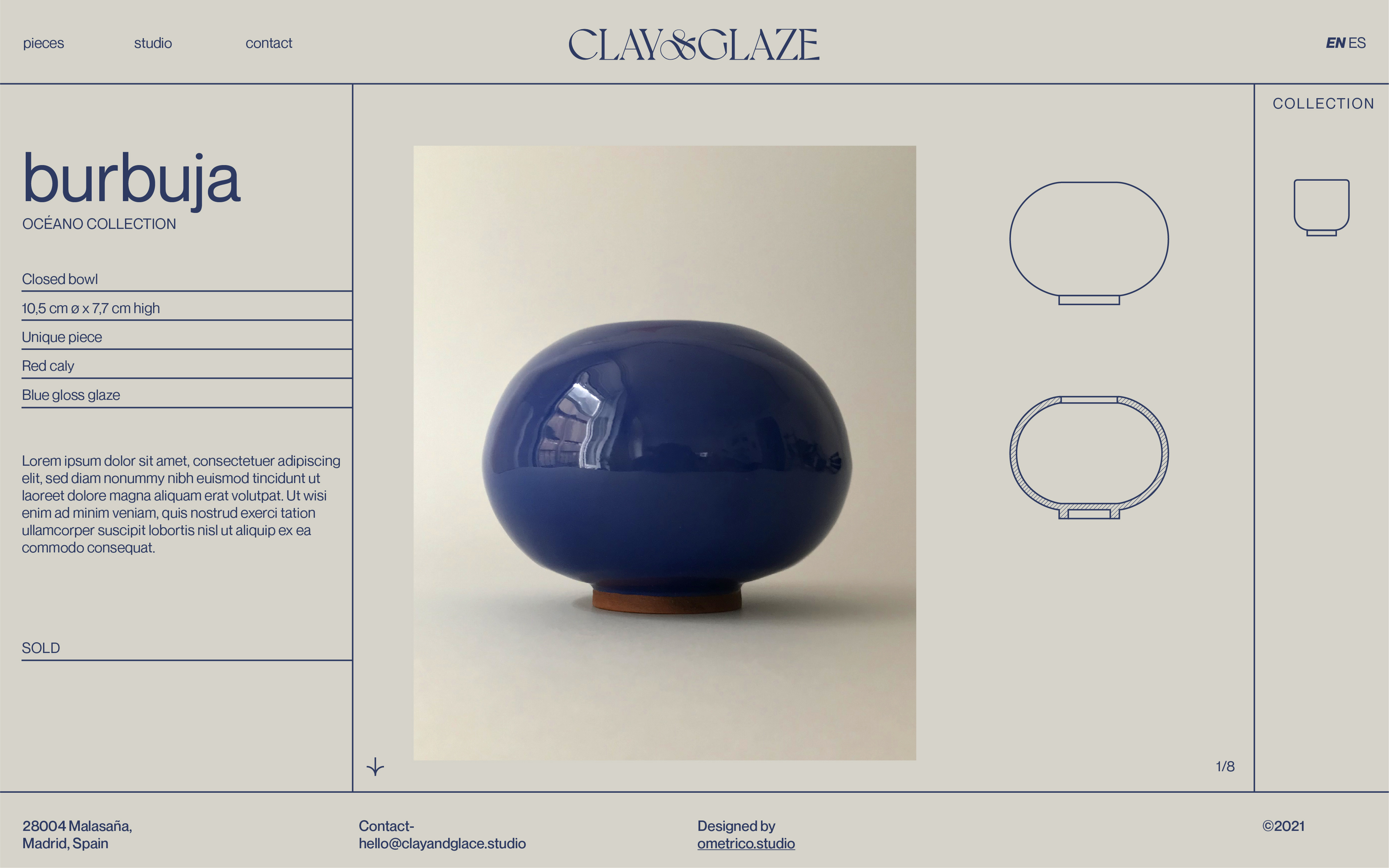
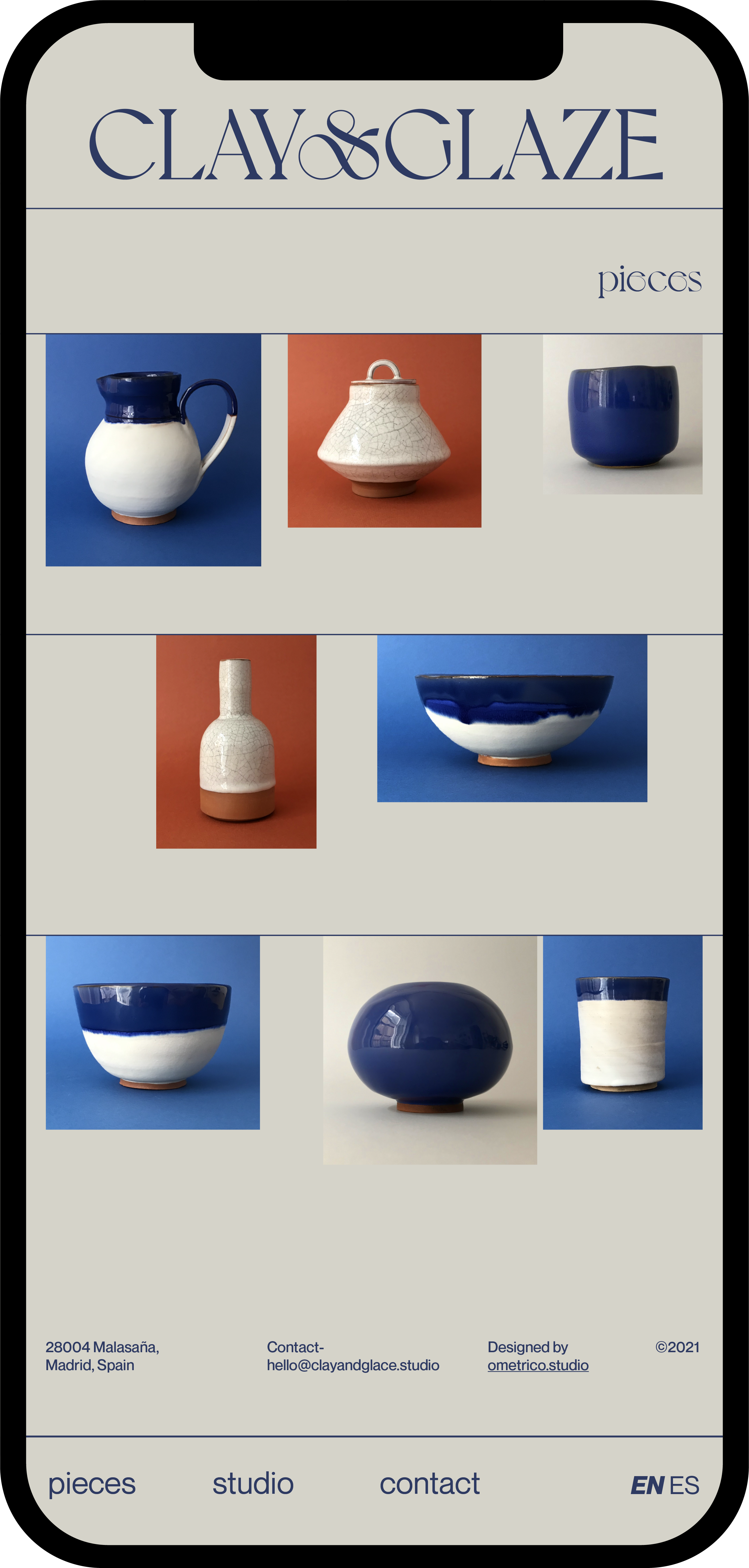
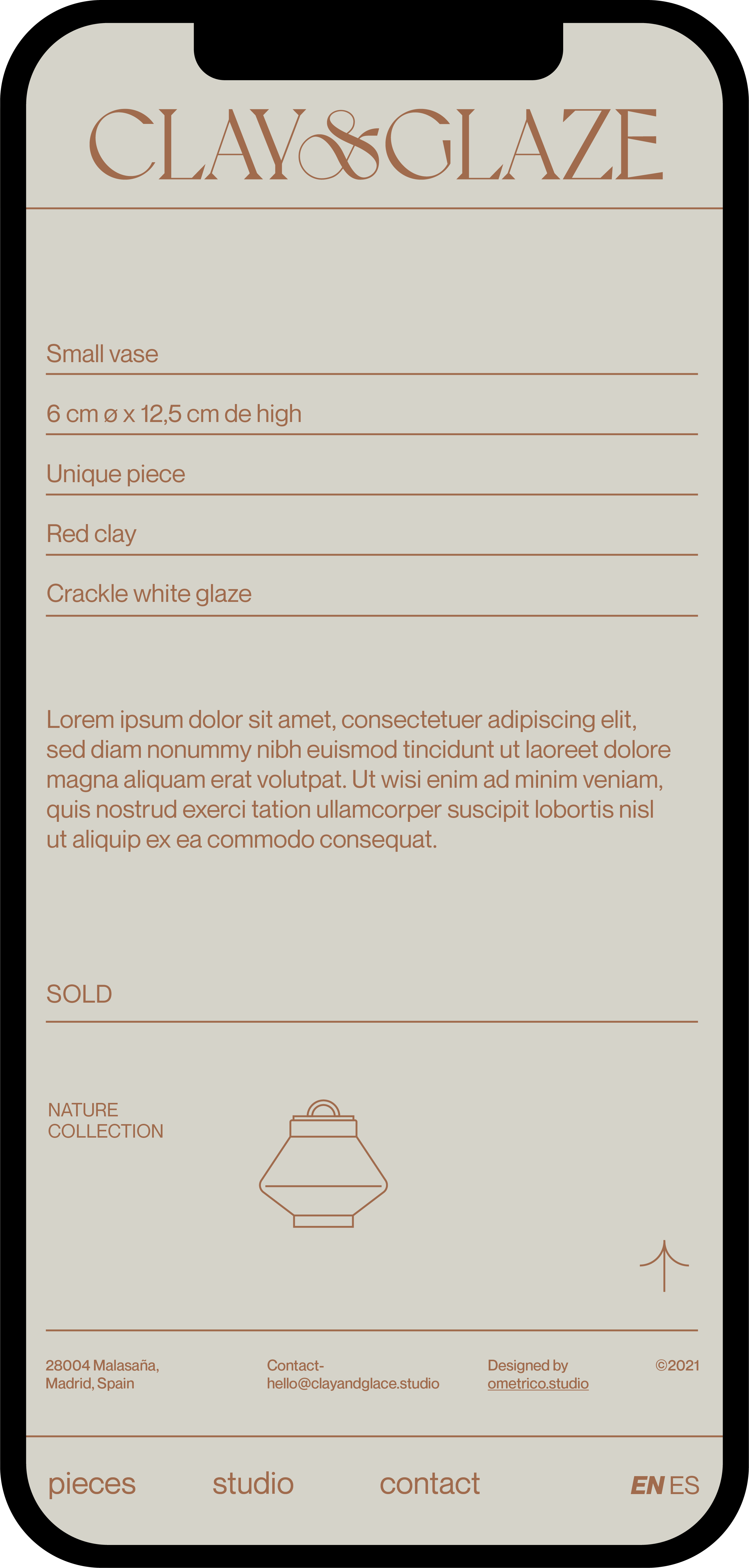
The product part becomes a structured, clean and ample showcase for the pieces. As a curiosity, depending on the collection, the colour of the elements can change to harmonise with the background colour of the piece and create a more homogeneous effect that highlights the structure of the information and images.
La parte de producto se convierte en un escaparate estructurado, limpio y amplio para dar lugar a las piezas. Como curiosidad, dependiendo de la colección, el color de los elementos pueden cambiar para armonizarse con el color de fondo de la pieza y crear un efecto más homogéneo que hace destacar la estructura de la información y las imágenes.

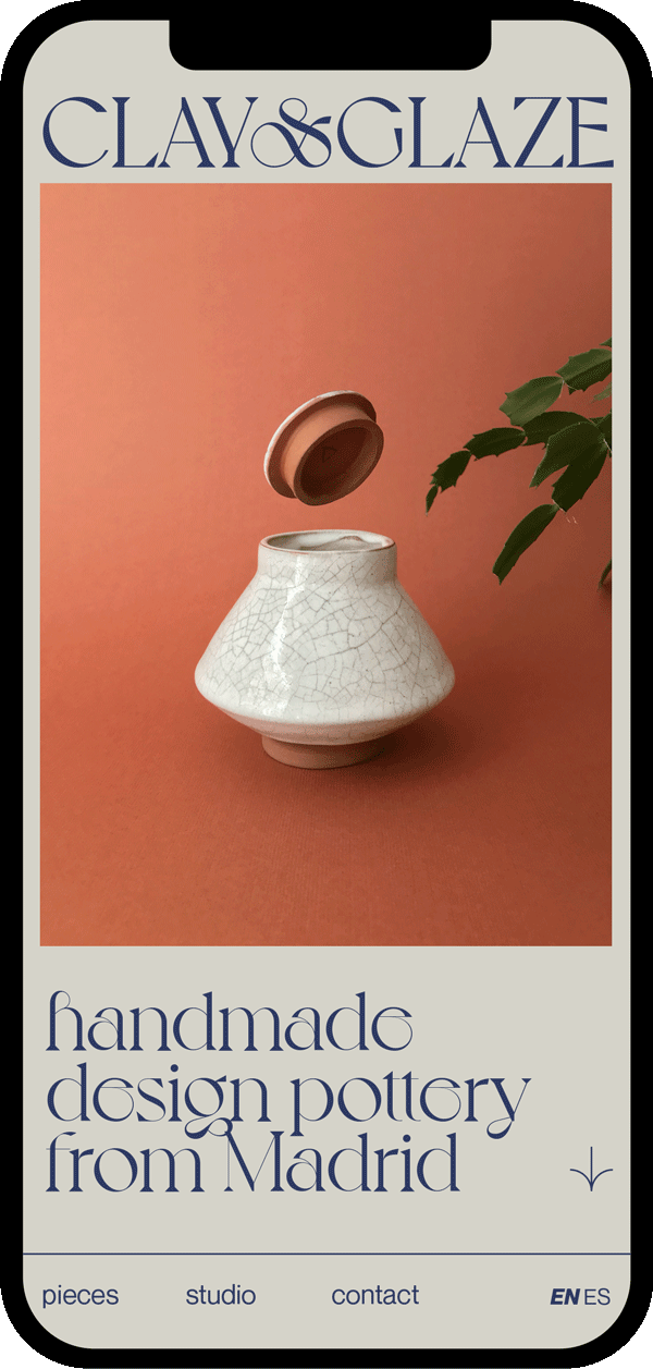
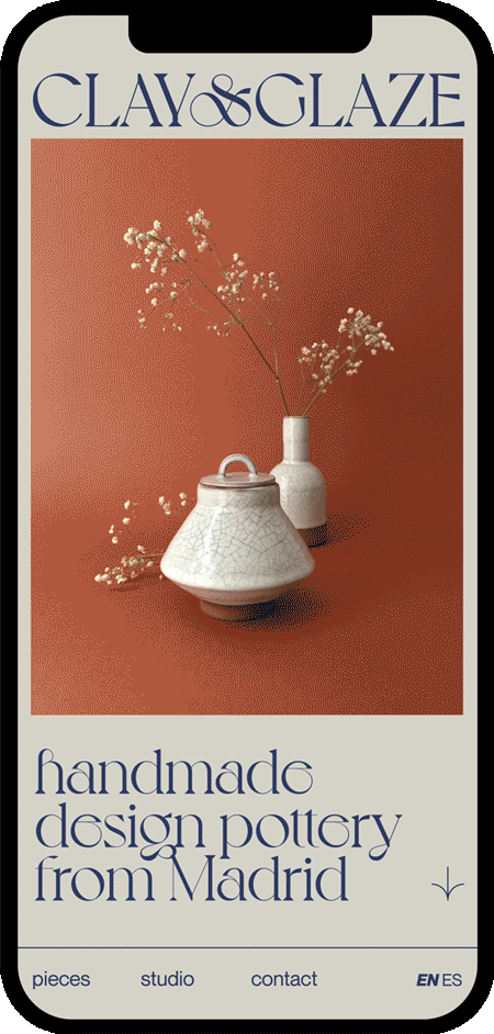
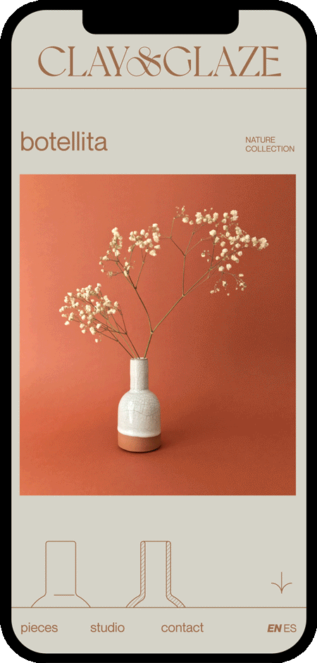
And then the mobile version where both the experience and the information are adapted to be consumed vertically without losing their character or essence.
Y a continuación la adaptación mobile donde tanto la experiencia como la información se adaptan para ser consumidos de forma vertical sin perder ni su carácter ni la esencia.


Thank’s for watching
Gracias por verlo